Alara Resources
The spirit of discovery, pioneering the search for metals crucial to a brighter tomorrow.
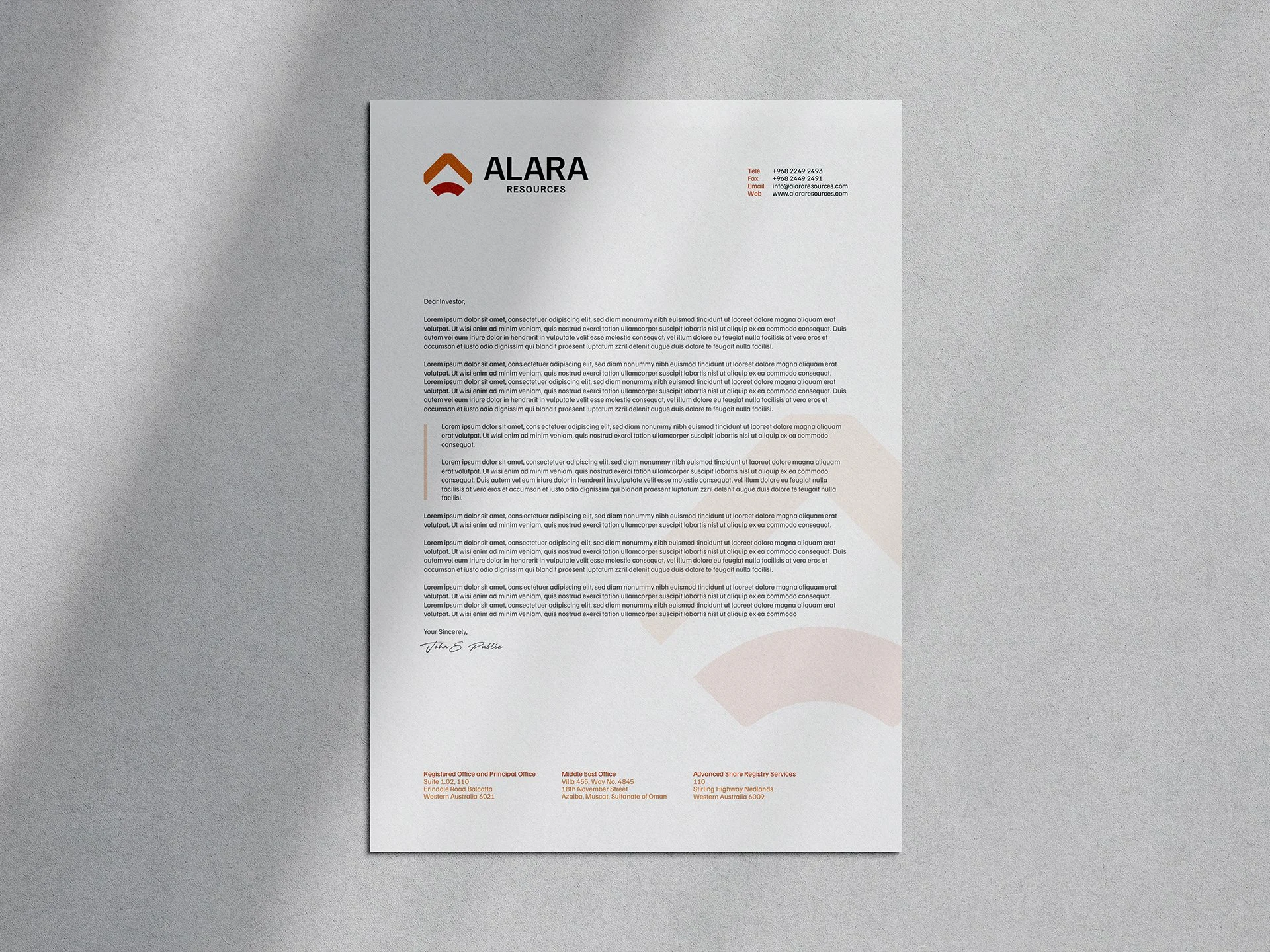
We embark on a journey of transformation with Alara Resources, an ASX-listed mineral exploration and mining company. With a commitment to innovation and a vision to redefine their industry presence, Alara Resources embarked on a strategic rebranding endeavour.
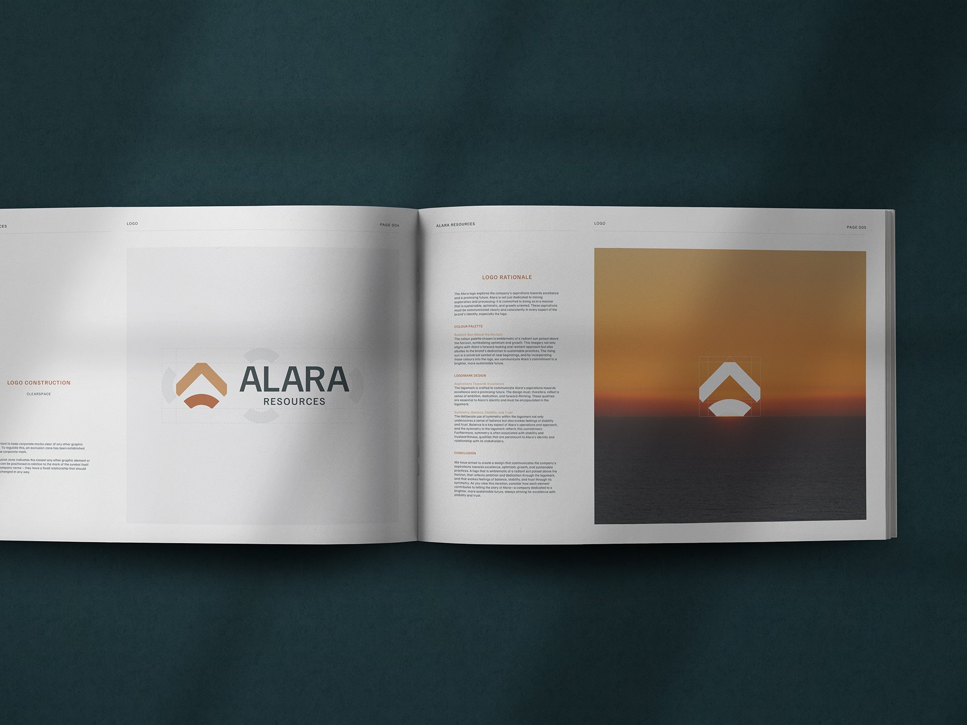
The colour palette chosen is emblematic of a radiant sun poised above the horizon, symbolising optimism and growth. This imagery not only aligns with Alara’s forward-looking and resilient approach but also alludes to the brand’s dedication to sustainable practices. The rising sun is a universal symbol of new beginnings, and by incorporating these colours into the logo, we communicate Alara’s commitment to a brighter, more sustainable future.
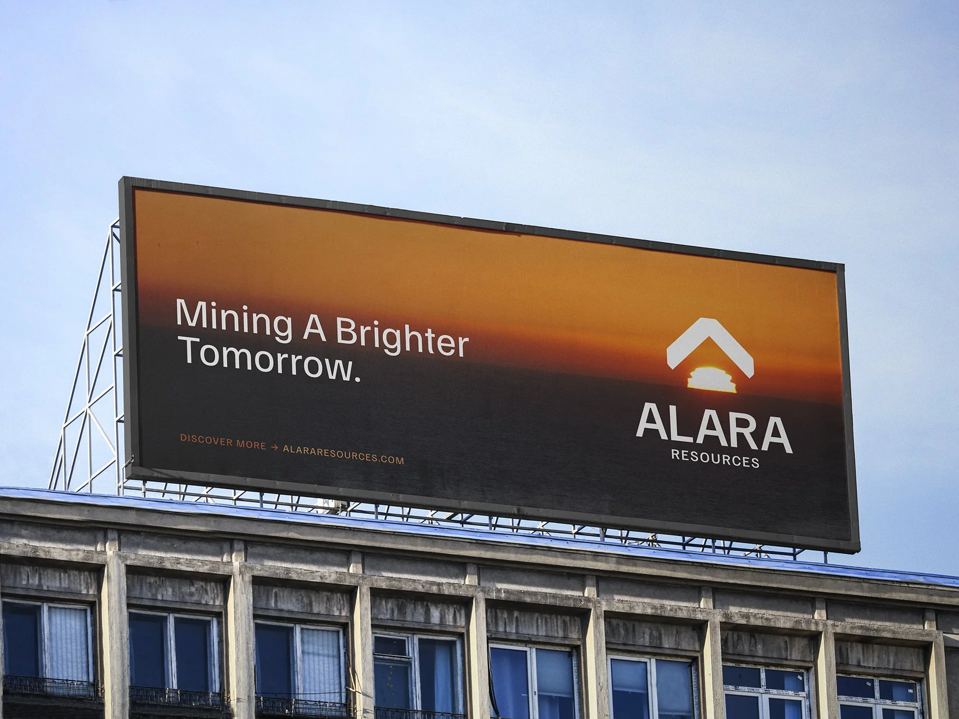
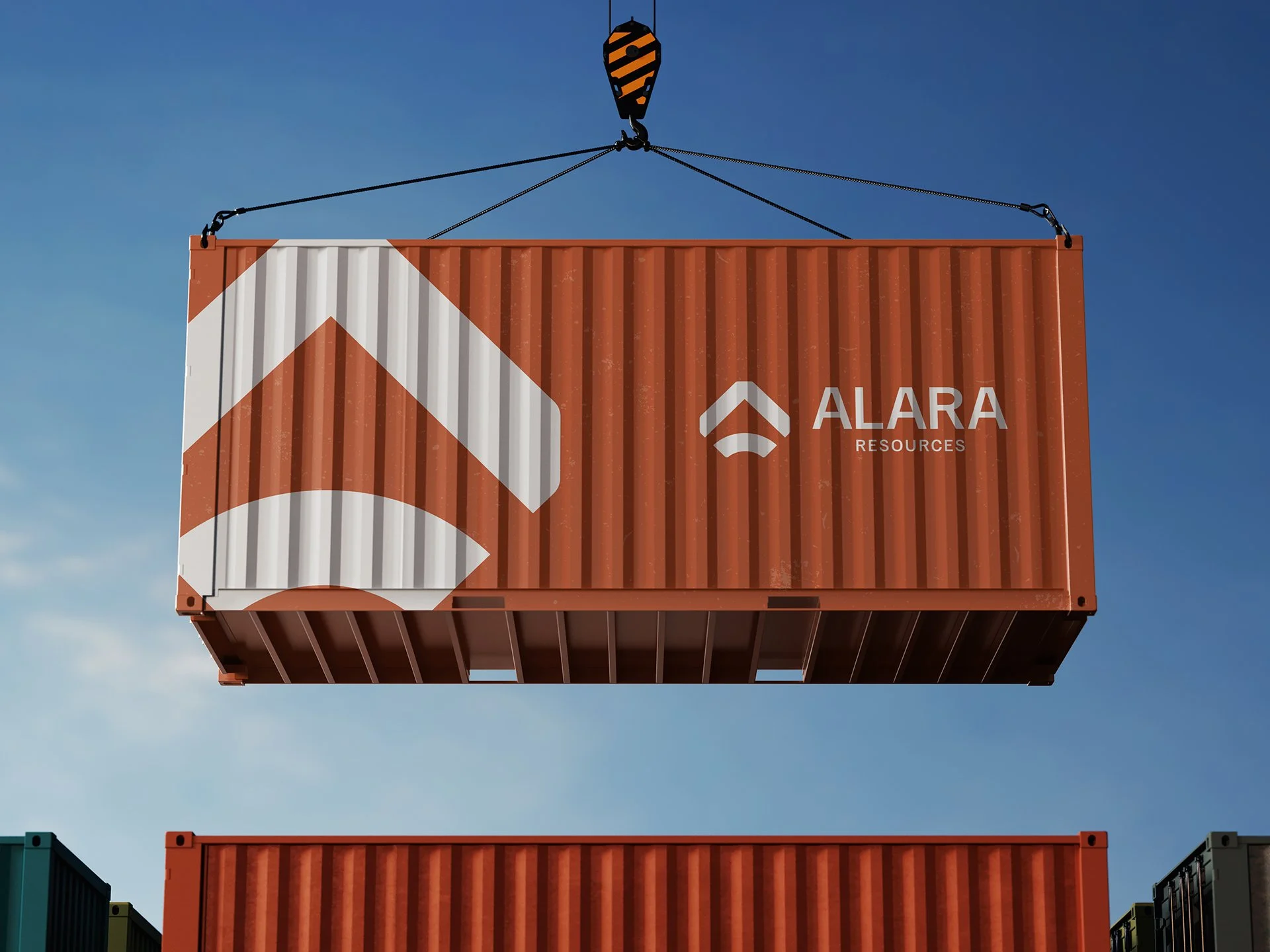
The Alara logo explores the company’s aspirations towards excellence and a promising future. Alara is not just dedicated to mining exploration and processing; it is committed to doing so in a manner that is sustainable, optimistic, and growth-oriented. These aspirations must be communicated clearly and consistently in every aspect of the brand’s identity, especially the logo.