Sir Manong
A bold, character-led identity for a modern Filipino restaurant chain.


Sir Manong is a contemporary Filipino restaurant concept bringing elevated street-style flavours and warm hospitality to the fast-casual dining scene. With expansion on the horizon, the brand needed a visual identity that felt distinctive, memorable, and full of character — something that would resonate with both everyday diners and a new generation of Filipino-Australian food lovers.
We set out to build a brand identity that was punchy, playful, and proudly Filipino. The name Sir Manong — a blend of formality and familiarity — gave us a strong narrative foundation. From there, the visual identity needed to express confidence without pretension, tradition without cliché. Every element had to feel accessible and spirited, capable of rolling out seamlessly across signage, menus, uniforms, packaging and digital platforms.
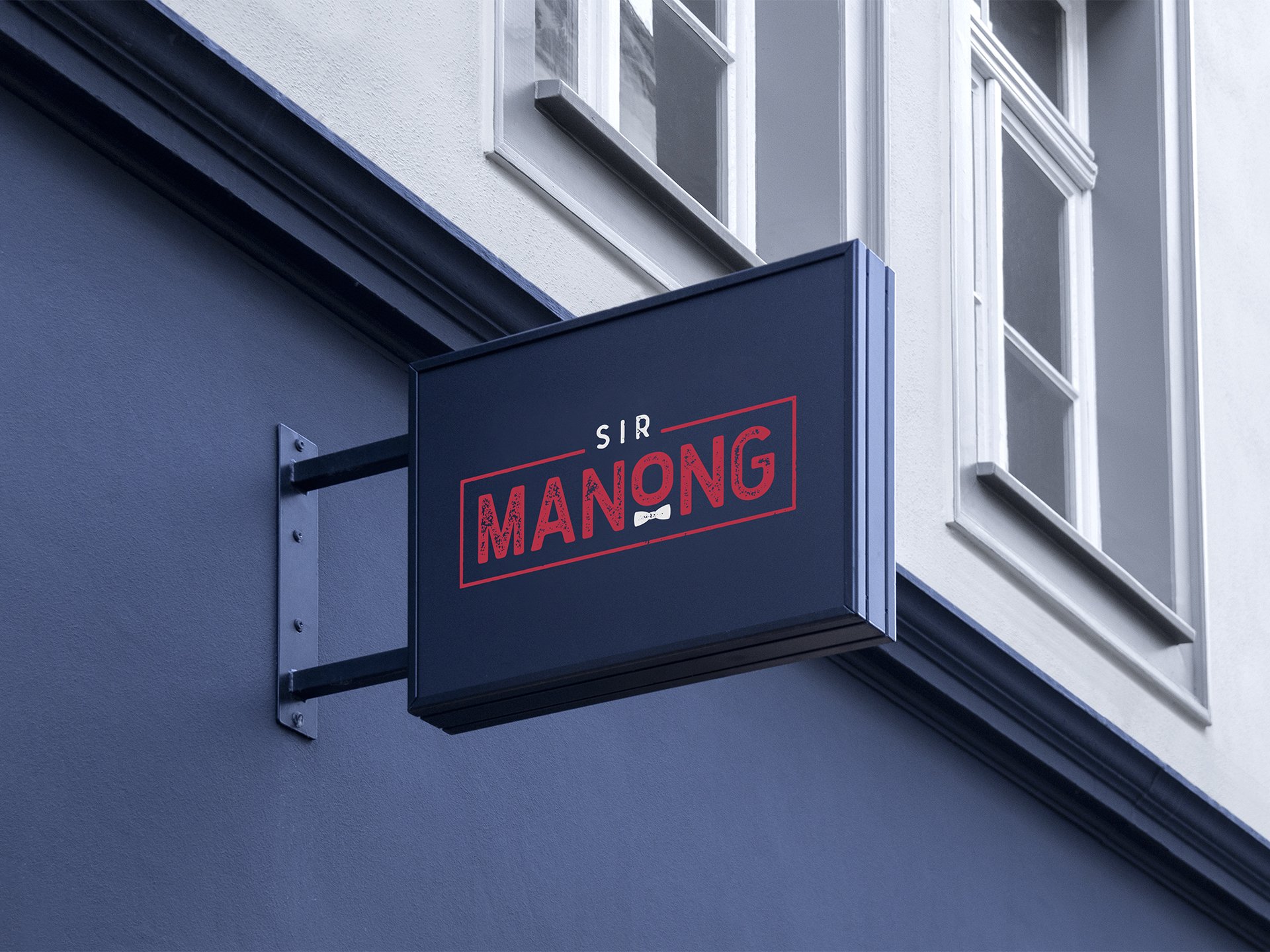
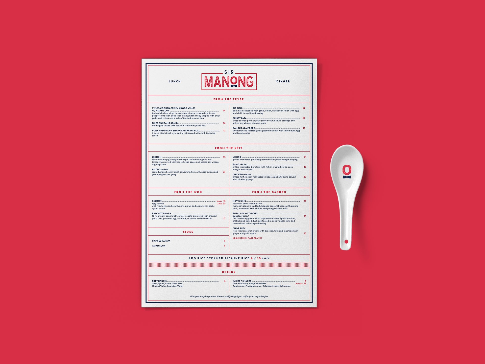
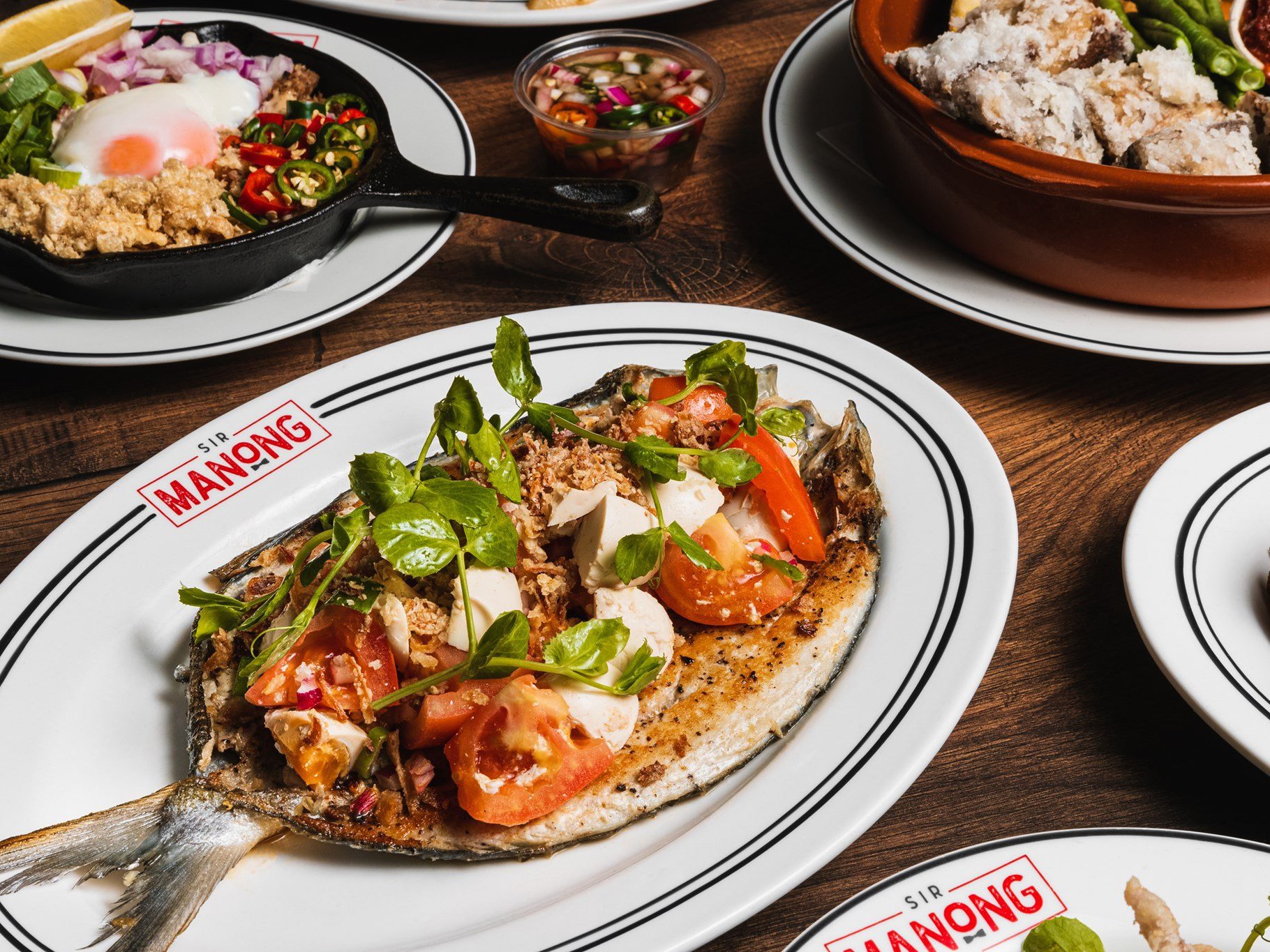
The identity is anchored by a bold logotype, finished with a subtly distressed texture and underscored by a signature bowtie — a visual nod to the name and a symbol of approachable formality. A vibrant red, navy and off-white palette keeps the look punchy and energetic, while custom brand assets — including monogram applications, framed layouts, and playful menu graphics — create a unified experience across dine-in and takeaway. The result is a brand that feels equal parts street-smart and polished, ready to grow without losing its local charm.
The Sir Manong identity strikes a balance between heritage and modernity — confident, cohesive, and full of flavour. As the restaurant expands, the brand now has a visual foundation strong enough to scale, while staying true to its roots.
INTERIOR & FIT-OUT DESIGN BY TINY GIANT.


