TerraRossa
A purposeful identity for a firm shaping inclusive, future-ready places, economies and communities.
TerraRossa is a strategic advisory firm working across government, infrastructure and placemaking. With a focus on inclusive growth, community outcomes and economic innovation, the business needed a brand identity that could speak with clarity and authority — while reflecting the human impact at the heart of their work.
The result is a confident, future-focused identity designed to support complex ideas, build trust, and lead with intention.

We set out to build an identity that balanced structure with approachability. The system needed to feel intelligent, calm and enduring, while supporting the company’s diverse partnerships across policy, investment and development sectors. Every element was designed to reflect the brand’s measured clarity and commitment to progress — from its modular geometry to its grounded, natural palette.

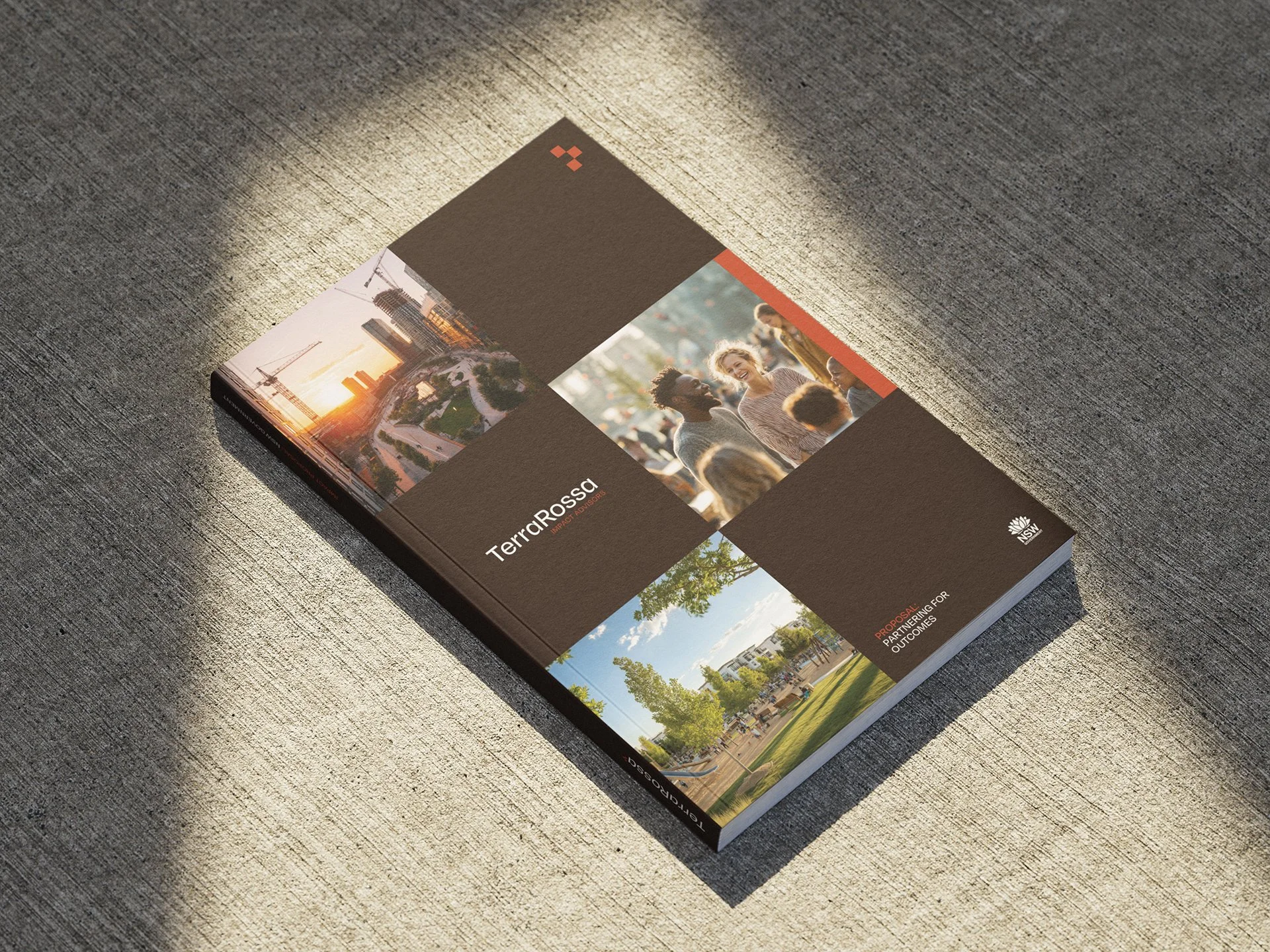
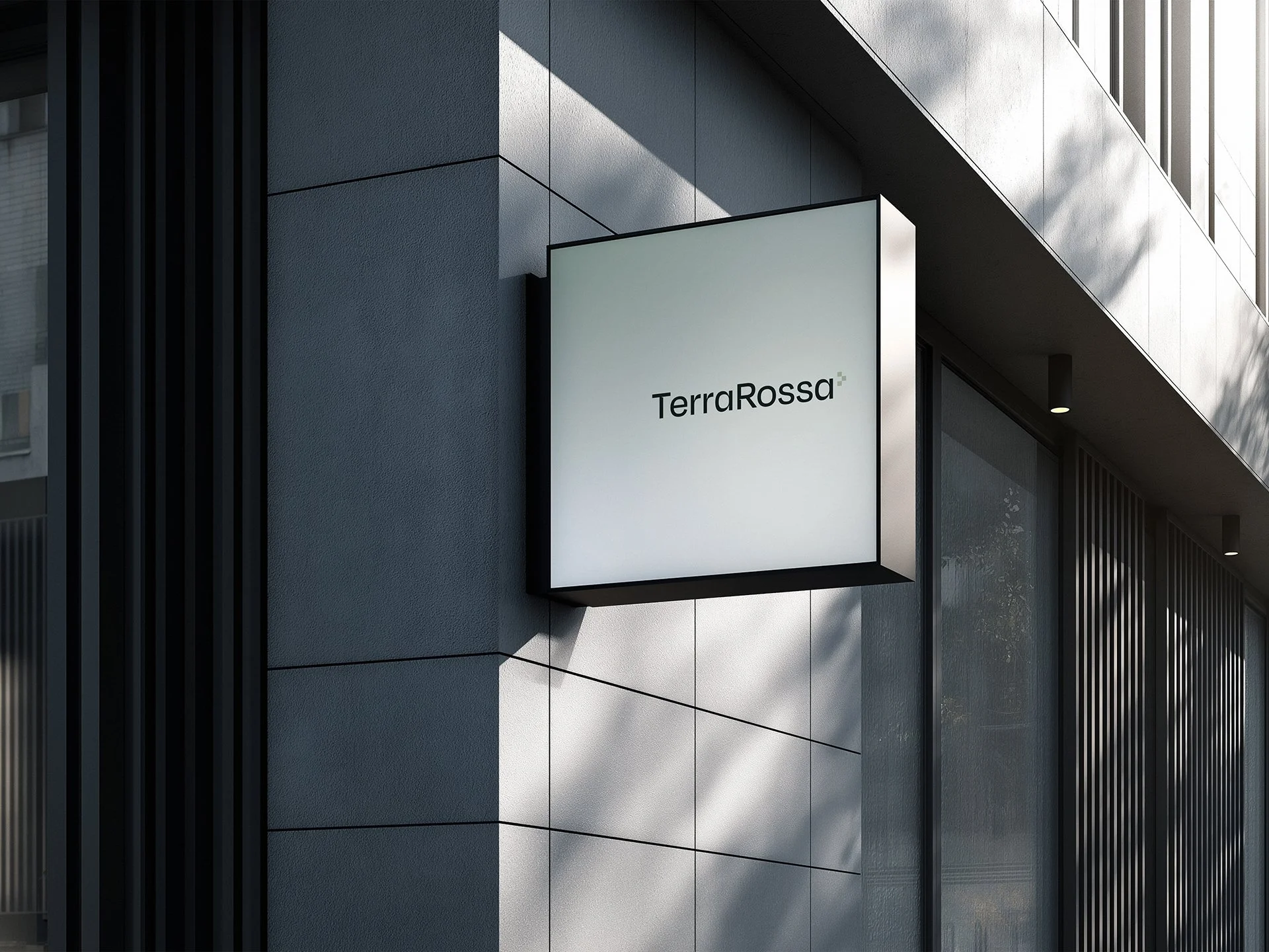
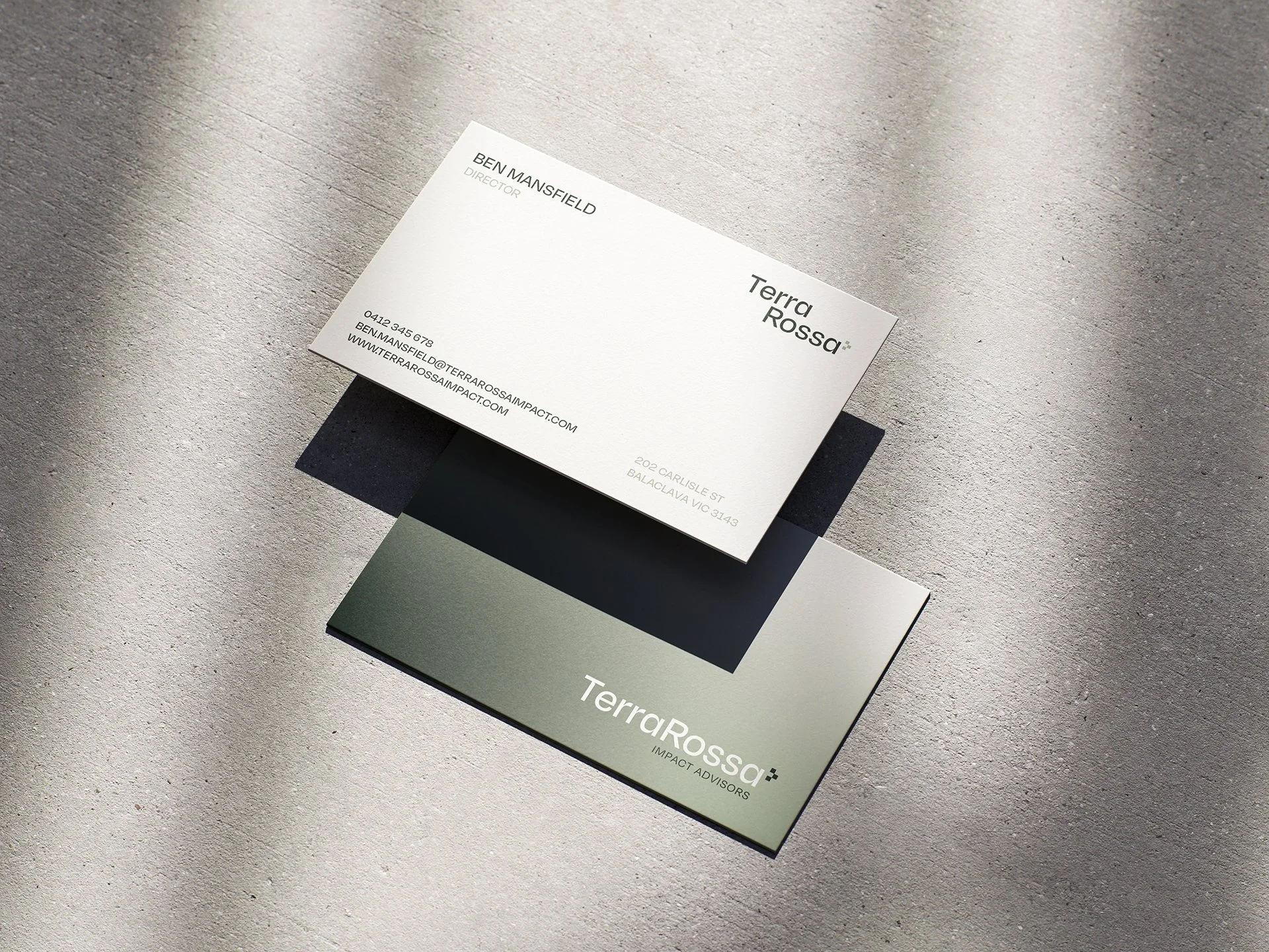
The typography is clean and modern, with rounded forms that bring warmth and accessibility to the TerraRossa name. It projects professionalism while softening what could otherwise be a rigid identity, achieving a balance between structure and humanity. The symbol is constructed from modular blocks that can be read in multiple ways — as a stylised “T”, as building blocks representing collaboration and complexity, or as an arrow symbolising progress and forward momentum.
The colour palette combines earthy brown, sage and forest green with clean white and a burnt-orange clay accent, a nod to terra rossa or “red soil”. These tones connect the brand to its namesake while evoking growth, groundedness and renewal. The result is a system that feels confident, heritage-driven and distinctly modern.
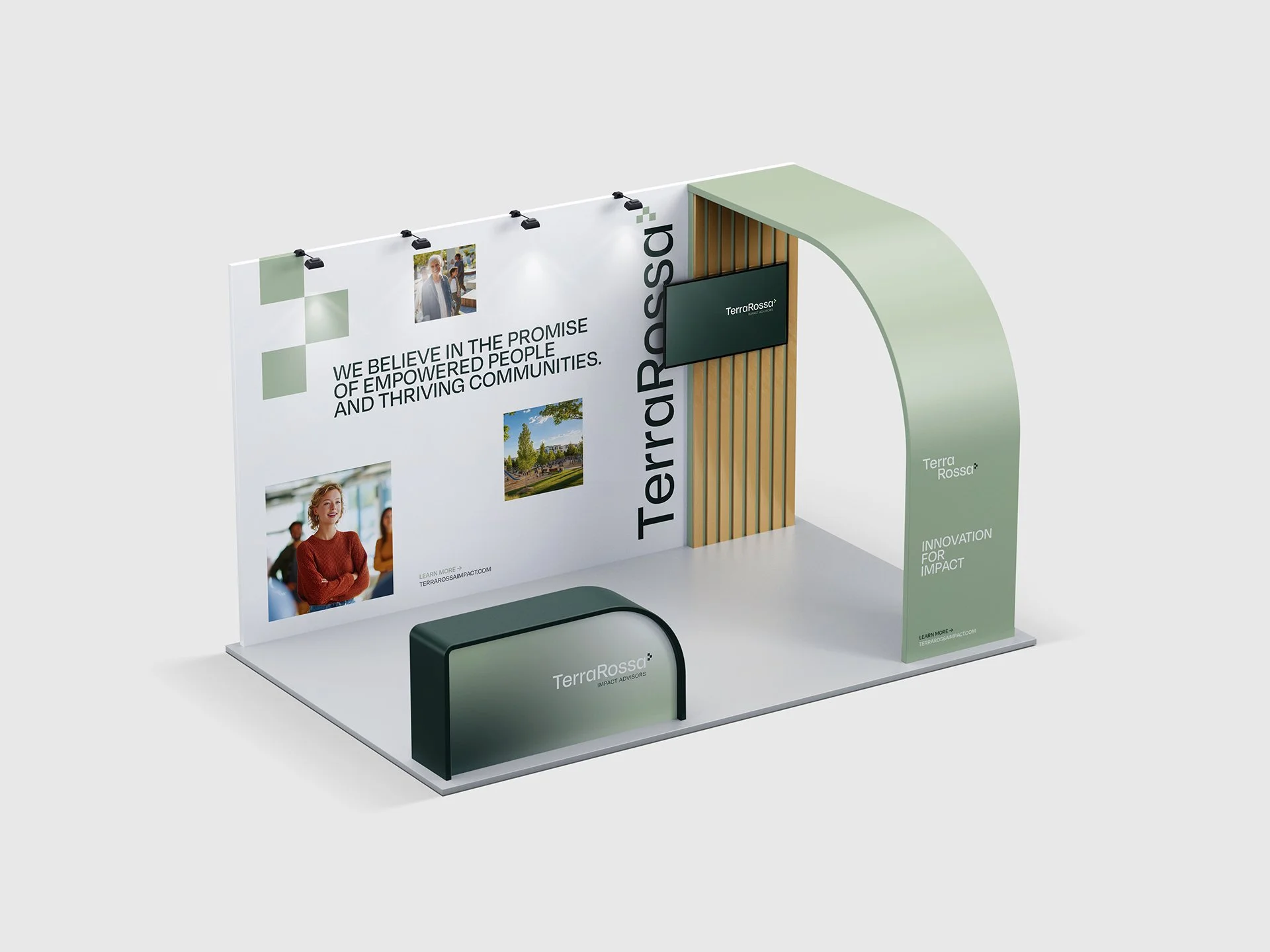

The new identity positions TerraRossa as a trusted advisor in social, economic and environmental impact. Grounded yet aspirational, it embodies the firm’s belief in shaping meaningful outcomes through insight, innovation and collaboration — a brand built to inspire confidence and drive change.