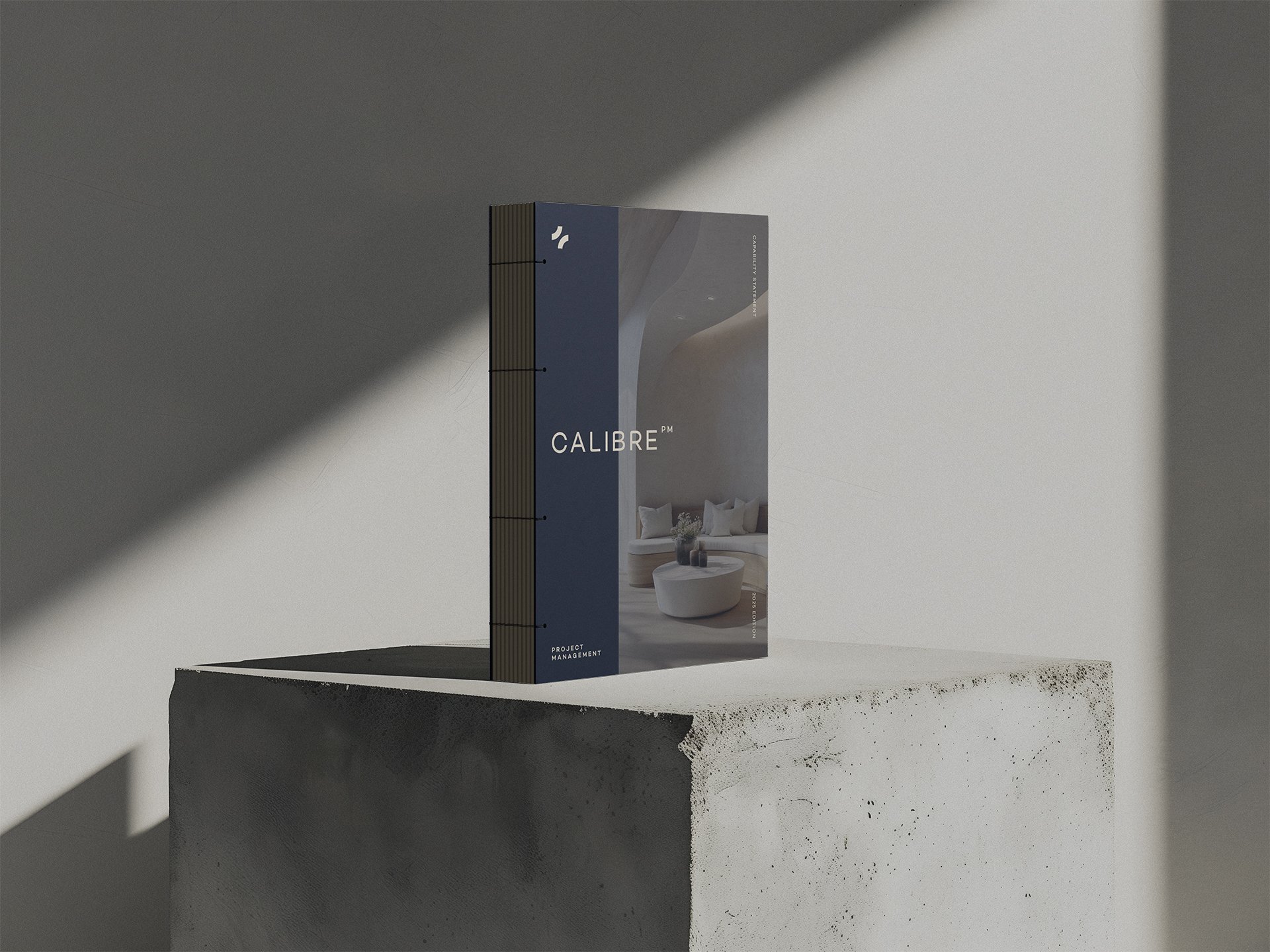
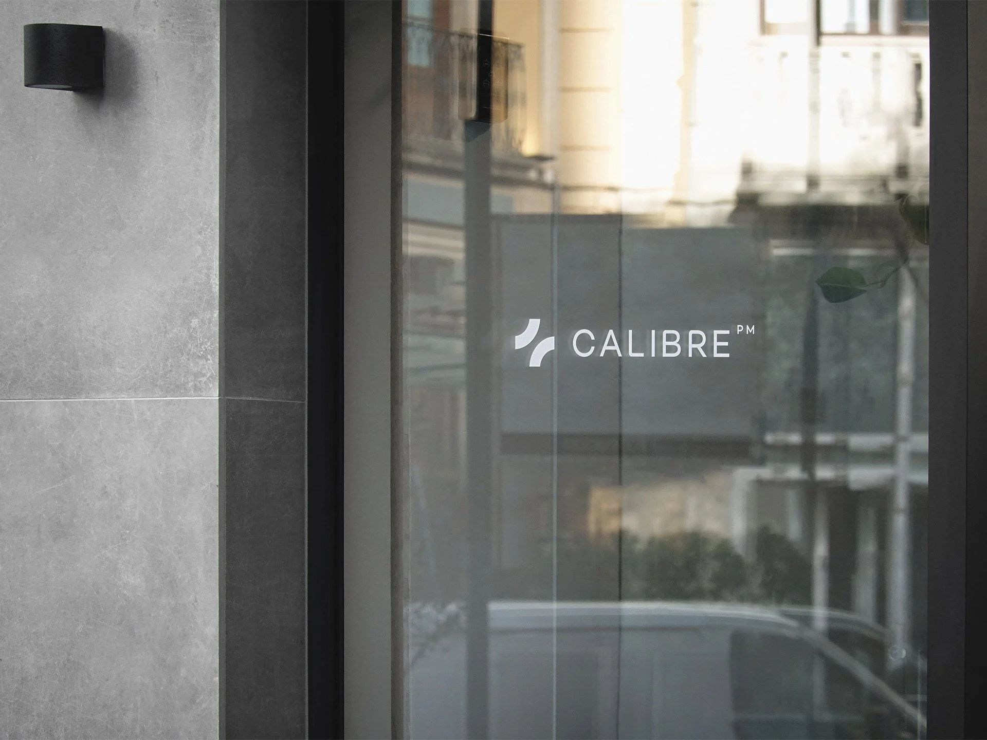
Calibre PM
A confident identity for a project management firm built on precision, clarity and control.
Calibre PM is a Sydney-based project management firm operating across commercial, education, health and infrastructure sectors. Known for its methodical approach and commitment to delivery, the business required a visual identity that would reflect its clarity, experience and professionalism.
The rebrand needed to strike the right balance — modern yet grounded, authoritative yet approachable — with a visual system that would scale seamlessly across digital, print and on-site applications.
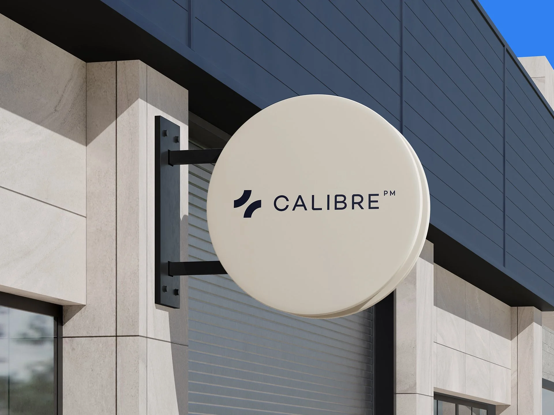
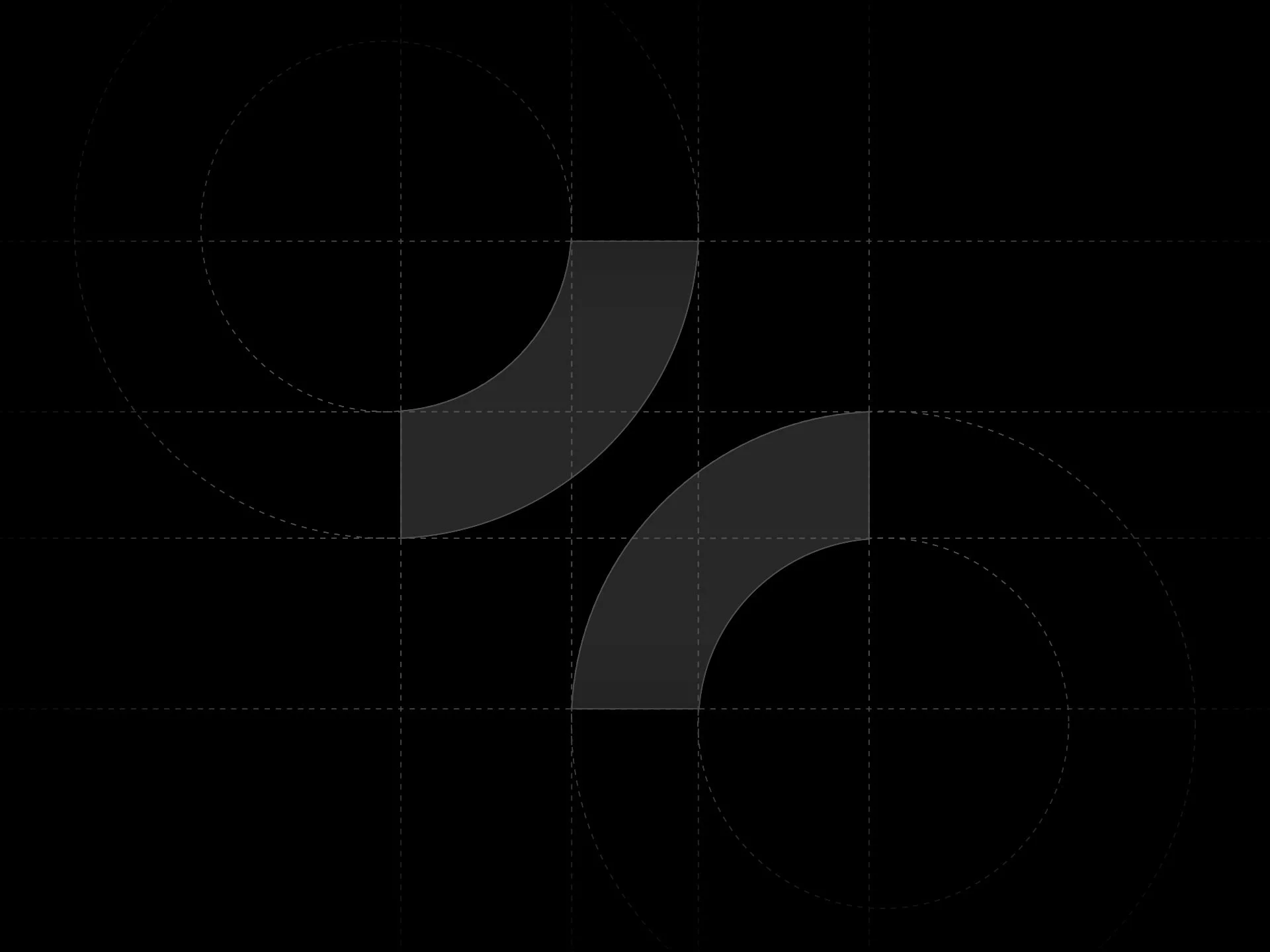
The logomark is built from two balanced quarter-circle forms drawn from the curvature of the letter ‘C’. Their mirrored arrangement captures both structure and motion — a visual metaphor for the dual nature of project management: progress and stability. The clean, uniform linework suggests strength and reliability, while the negative space between forms introduces a sense of openness, clarity and momentum.
The mark is confident and scalable, pairing effortlessly with a custom wordmark and extended identity system. A considered colour palette and typographic hierarchy complete the brand — bold, minimal and designed for real-world use.
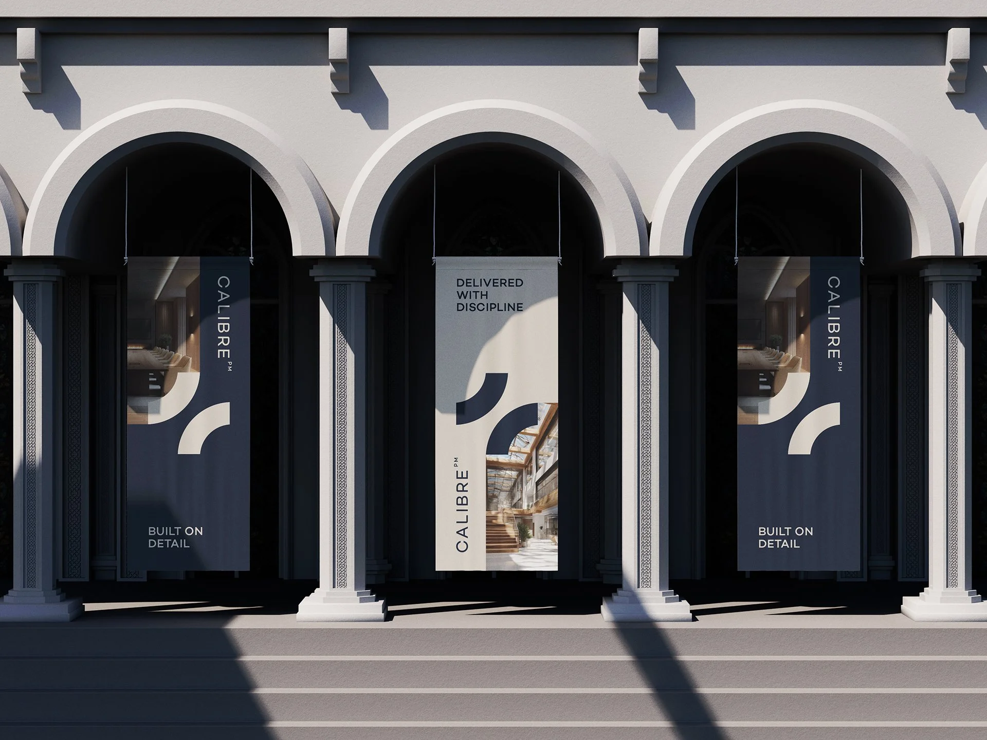
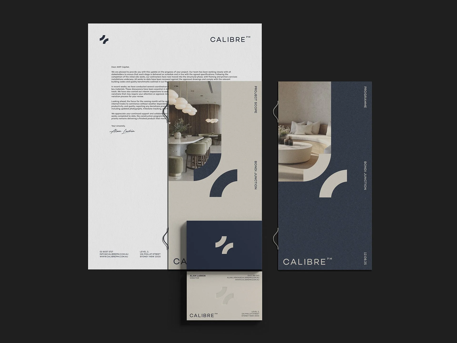
We set out to create an identity that reflected Calibre’s core strengths — clear thinking, structured delivery and enduring partnerships. The system needed to feel disciplined and precise, but never cold or overly corporate. We developed a geometric, architectural design language that would sit confidently across all touchpoints — from tender documents and business cards to safety signage and construction fencing — communicating a sense of clarity and control in every application.

The new identity positions Calibre PM as a trusted partner in the built environment — clear, capable and future-focused. With a system built on precision and adaptability, the brand now has the confidence and flexibility to grow alongside the scale and complexity of the projects it delivers.