
Pepe’s Beachside Bar
Wollongong’s favourite beachside destination undergoes a fresh rebrand.
Pepe’s is a relaxed restaurant and bar located on Wollongong’s beachfront, serving up casual, coastal dining in a laid-back atmosphere. With a backdrop of golden sand and rolling surf, the venue needed a brand identity that would capture the spirit of the space — bright, approachable, and effortlessly cool.
Inspired by the energy of California’s beach towns, the rebrand leans into retro sun culture, bold type, and punchy colour to create an experience that’s both nostalgic and now.

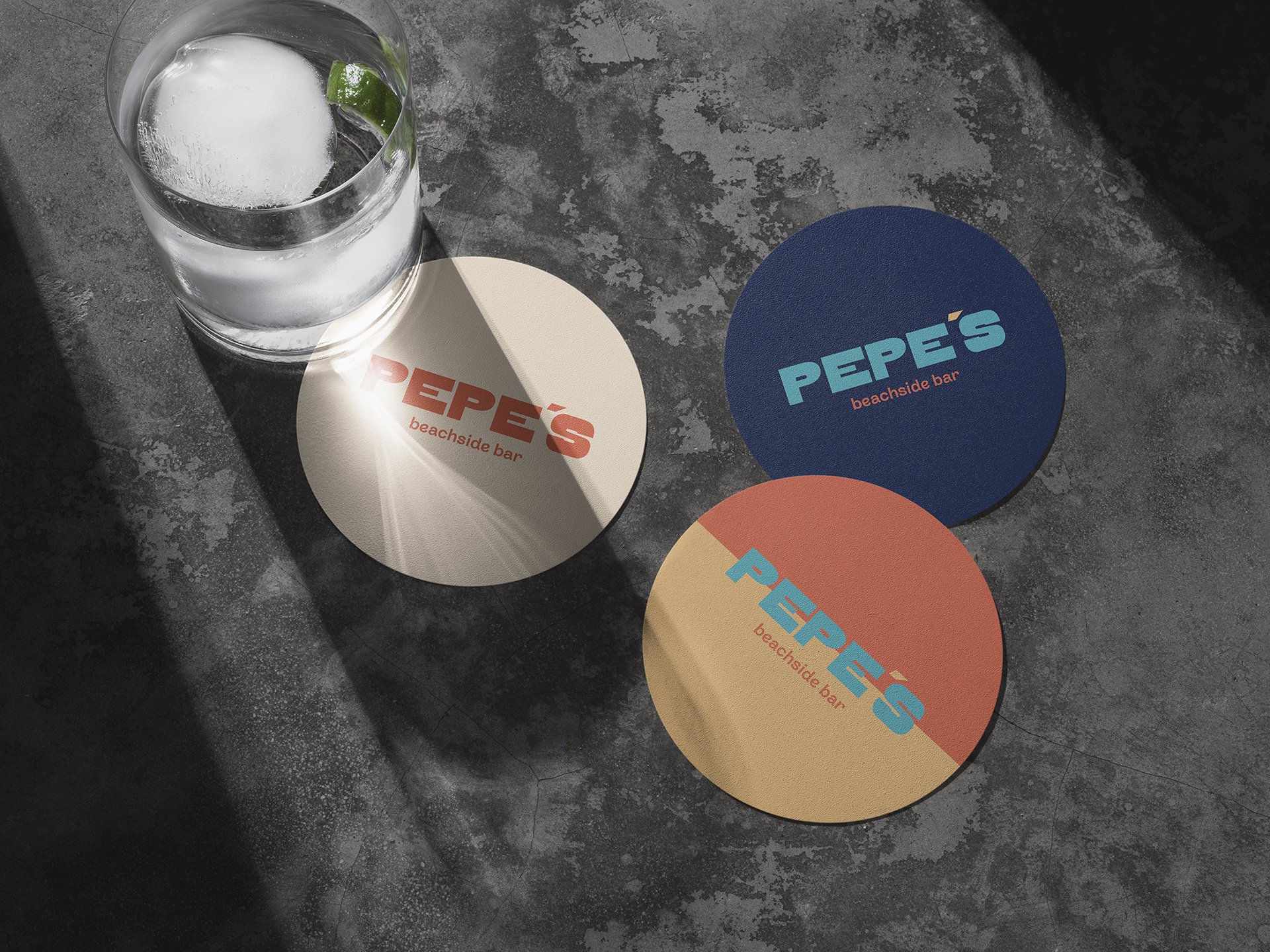
We set out to build a brand that feels warm, energetic and instantly inviting. Drawing on vintage surf and skate culture, we created a visual language that’s relaxed but impactful — the kind of brand that wears board shorts and knows how to throw a party. The identity needed to hold up across busy touchpoints like menus, signage and merchandise, while keeping things fun, flexible and full of personality.

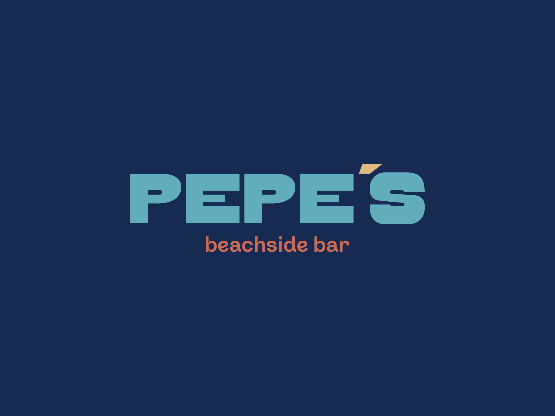
At the centre of the brand is a bold, retro-inspired wordmark — rounded, confident and full of movement. The colour palette is unapologetically coastal: sun-faded peach, ocean blue and golden sand tones bring warmth and energy to every application. Supporting graphics, playful type treatments, and loose illustrative details give the brand rhythm, echoing the carefree tempo of long summer days. Across digital, print and venue collateral, the identity captures the youthful, punchy tone that defines the Pepe’s experience.


The new identity has given Pepe’s a bold, beach-ready personality that feels right at home on the Wollongong coastline. Visually striking and unmistakably upbeat, the brand invites locals and visitors alike to settle in, grab a drink, and enjoy the view — no shoes required.


